WindowControls#
Superclasses: Widget, InitiallyUnowned, Object
Implemented Interfaces: Accessible, Buildable, ConstraintTarget
Shows window frame controls.
Typical window frame controls are minimize, maximize and close buttons, and the window icon.
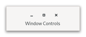
GtkWindowControls only displays start or end side of the controls (see
side), so it’s intended to be always used
in pair with another GtkWindowControls for the opposite side, for example:
<object class="GtkBox">
  <child>
    <object class="GtkWindowControls">
      <property name="side">start</property>
    </object>
  </child>

  ...

  <child>
    <object class="GtkWindowControls">
      <property name="side">end</property>
    </object>
  </child>
</object>
CSS nodes#
windowcontrols
├── [image.icon]
├── [button.minimize]
├── [button.maximize]
╰── [button.close]
A GtkWindowControls' CSS node is called windowcontrols. It contains
subnodes corresponding to each title button. Which of the title buttons
exist and where they are placed exactly depends on the desktop environment
and decoration_layout value.
When empty is true, it gets the .empty
style class.
Accessibility#
GtkWindowControls uses the group role.
Constructors#
Methods#
- class WindowControls
-
- get_use_native_controls() bool#
Returns whether platform native window controls are shown.
Added in version 4.18.
- set_decoration_layout(layout: str | None = None) None#
Sets the decoration layout for the title buttons.
This overrides the
gtk_decoration_layoutsetting.The format of the string is button names, separated by commas. A colon separates the buttons that should appear on the left from those on the right. Recognized button names are minimize, maximize, close and icon (the window icon).
For example, “icon:minimize,maximize,close” specifies a icon on the left, and minimize, maximize and close buttons on the right.
If
sidevalue isstart,selfwill display the part before the colon, otherwise after that.- Parameters:
layout – a decoration layout, or
NULLto unset the layout
- set_side(side: PackType) None#
Determines which part of decoration layout the window controls widget uses.
See
decoration_layout.- Parameters:
side – a side
- set_use_native_controls(setting: bool) None#
Sets whether platform native window controls are used.
This option shows the “stoplight” buttons on macOS. For Linux, this option has no effect.
See also Using GTK on Apple macOS.
Added in version 4.18.
- Parameters:
setting – true to show native window controls
Properties#
- class WindowControls
- props.decoration_layout: str#
The decoration layout for window buttons.
If this property is not set, the
gtk_decoration_layoutsetting is used.
- props.side: PackType#
Whether the widget shows start or end side of the decoration layout.
See
decoration_layout.
- props.use_native_controls: bool#
Whether to show platform native close/minimize/maximize buttons.
For macOS, the
decoration_layoutproperty controls the use of native window controls.On other platforms, this option has no effect.
See also Using GTK on Apple macOS.
Added in version 4.18.