PopoverMenu#
Superclasses: Popover, Widget, InitiallyUnowned, Object
Implemented Interfaces: Accessible, Buildable, ConstraintTarget, Native, ShortcutManager
GtkPopoverMenu is a subclass of GtkPopover that implements menu
behavior.
GtkPopoverMenu treats its children like menus and allows switching
between them. It can open submenus as traditional, nested submenus,
or in a more touch-friendly sliding fashion.
The property flags controls this appearance.
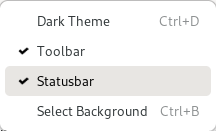
GtkPopoverMenu is meant to be used primarily with menu models,
using new_from_model. If you need to put
other widgets such as a GtkSpinButton or a GtkSwitch into a popover,
you can use add_child.
For more dialog-like behavior, use a plain GtkPopover.
Shortcuts and Gestures#
GtkPopoverMenu supports the following keyboard shortcuts:
Space activates the default widget.
CSS Nodes#
GtkPopoverMenu is just a subclass of GtkPopover that adds custom content
to it, therefore it has the same CSS nodes. It is one of the cases that add
a .menu style class to the main popover node.
Menu items have nodes with name button and class .model. If a section
display-hint is set, the section gets a node box with class horizontal
plus a class with the same text as the display hint. Note that said box may
not be the direct ancestor of the item buttons. Thus, for example, to style
items in an inline-buttons section, select .inline-buttons button.model.
Other things that may be of interest to style in menus include label nodes.
Accessibility#
GtkPopoverMenu uses the MENU role, and its
items use the MENU_ITEM,
MENU_ITEM_CHECKBOX or
MENU_ITEM_RADIO roles, depending on the
action they are connected to.
Constructors#
- class PopoverMenu
- classmethod new_from_model(model: MenuModel | None = None) Widget#
Creates a
GtkPopoverMenuand populates it according tomodel.The created buttons are connected to actions found in the
GtkApplicationWindowto which the popover belongs - typically by means of being attached to a widget that is contained within theGtkApplicationWindows widget hierarchy.Actions can also be added using
insert_action_groupon the menus attach widget or on any of its parent widgets.This function creates menus with sliding submenus. See
new_from_model_fullfor a way to control this.- Parameters:
model – a
GMenuModel
- classmethod new_from_model_full(model: MenuModel, flags: PopoverMenuFlags) Widget#
Creates a
GtkPopoverMenuand populates it according tomodel.The created buttons are connected to actions found in the action groups that are accessible from the parent widget. This includes the
GtkApplicationWindowto which the popover belongs. Actions can also be added usinginsert_action_groupon the parent widget or on any of its parent widgets.- Parameters:
model – a
GMenuModelflags – flags that affect how the menu is created
Methods#
- class PopoverMenu
- add_child(child: Widget, id: str) bool#
Adds a custom widget to a generated menu.
For this to work, the menu model of
popovermust have an item with acustomattribute that matchesid.- Parameters:
child – the
GtkWidgetto addid – the ID to insert
childat
- get_flags() PopoverMenuFlags#
Returns the flags that
popoveruses to create/display a menu from its model.Added in version 4.14.
Returns the menu model used to populate the popover.
- remove_child(child: Widget) bool#
Removes a widget that has previously been added with
add_child()- Parameters:
child – the
GtkWidgetto remove
- set_flags(flags: PopoverMenuFlags) None#
Sets the flags that
popoveruses to create/display a menu from its model.If a model is set and the flags change, contents are rebuilt, so if setting properties individually, set flags before model to avoid a redundant rebuild.
Added in version 4.14.
- Parameters:
flags – a set of
GtkPopoverMenuFlags
Sets a new menu model on
popover.The existing contents of
popoverare removed, and thepopoveris populated with new contents according tomodel.- Parameters:
model – a
GMenuModel
Properties#
- class PopoverMenu
- props.flags: PopoverMenuFlags#
The type of the None singleton.
Added in version 4.14.
The type of the None singleton.
The type of the None singleton.