Switch#
Superclasses: Widget, InitiallyUnowned, Object
Implemented Interfaces: Accessible, Actionable, Buildable, ConstraintTarget
Shows a “light switch” that has two states: on or off.
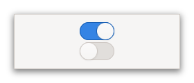
The user can control which state should be active by clicking the empty area, or by dragging the slider.
GtkSwitch can also express situations where the underlying state changes
with a delay. In this case, the slider position indicates the user’s recent
change (represented by the active property), while the
trough color indicates the present underlying state (represented by the
state property).

See state_set for details.
Shortcuts and Gestures#
GtkSwitch supports pan and drag gestures to move the slider.
CSS nodes#
switch
├── image
├── image
╰── slider
GtkSwitch has four css nodes, the main node with the name switch and
subnodes for the slider and the on and off images. Neither of them is
using any style classes.
Accessibility#
GtkSwitch uses the switch role.
Constructors#
Methods#
Properties#
- class Switch
Signals#
- class Switch.signals
- activate() None#
Emitted to animate the switch.
Applications should never connect to this signal, but use the
activeproperty.
- state_set(state: bool) bool#
Emitted to change the underlying state.
The ::state-set signal is emitted when the user changes the switch position. The default handler calls
set_statewith the value ofstate.To implement delayed state change, applications can connect to this signal, initiate the change of the underlying state, and call
set_statewhen the underlying state change is complete. The signal handler should returnTrueto prevent the default handler from running.- Parameters:
state – the new state of the switch