ColorButton#
Deprecated since version 4.10: Use ColorDialogButton instead
Superclasses: Widget, InitiallyUnowned, Object
Implemented Interfaces: Accessible, Buildable, ColorChooser, ConstraintTarget
The GtkColorButton allows to open a color chooser dialog to change
the color.
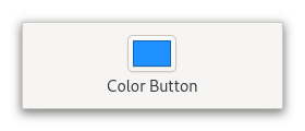
It is suitable widget for selecting a color in a preference dialog.
CSS nodes#
colorbutton
╰── button.color
    ╰── [content]
GtkColorButton has a single CSS node with name colorbutton which
contains a button node. To differentiate it from a plain GtkButton,
it gets the .color style class.
Constructors#
- class ColorButton
- classmethod new() Widget#
Creates a new color button.
This returns a widget in the form of a small button containing a swatch representing the current selected color. When the button is clicked, a color chooser dialog will open, allowing the user to select a color. The swatch will be updated to reflect the new color when the user finishes.
Deprecated since version 4.10: Use
ColorDialogButtoninstead
Methods#
- class ColorButton
- get_modal() bool#
Gets whether the dialog is modal.
Deprecated since version 4.10: Use
ColorDialogButtoninstead
- get_title() str#
Gets the title of the color chooser dialog.
Deprecated since version 4.10: Use
ColorDialogButtoninstead
- set_modal(modal: bool) None#
Sets whether the dialog should be modal.
Deprecated since version 4.10: Use
ColorDialogButtoninstead- Parameters:
modal –
Trueto make the dialog modal
- set_title(title: str) None#
Sets the title for the color chooser dialog.
Deprecated since version 4.10: Use
ColorDialogButtoninstead- Parameters:
title – String containing new window title