Entry#
Superclasses: Widget, InitiallyUnowned, Object
Implemented Interfaces: Accessible, Buildable, CellEditable, ConstraintTarget, Editable
A single-line text entry widget.
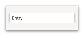
A fairly large set of key bindings are supported by default. If the entered text is longer than the allocation of the widget, the widget will scroll so that the cursor position is visible.
When using an entry for passwords and other sensitive information, it
can be put into “password mode” using set_visibility.
In this mode, entered text is displayed using a “invisible” character.
By default, GTK picks the best invisible character that is available
in the current font, but it can be changed with
set_invisible_char.
GtkEntry has the ability to display progress or activity
information behind the text. To make an entry display such information,
use set_progress_fraction or
set_progress_pulse_step.
Additionally, GtkEntry can show icons at either side of the entry.
These icons can be activatable by clicking, can be set up as drag source
and can have tooltips. To add an icon, use
set_icon_from_gicon or one of the various other functions
that set an icon from an icon name or a paintable. To trigger an action when
the user clicks an icon, connect to the icon_press signal.
To allow DND operations from an icon, use
set_icon_drag_source. To set a tooltip on an icon, use
set_icon_tooltip_text or the corresponding function
for markup.
Note that functionality or information that is only available by clicking on an icon in an entry may not be accessible at all to users which are not able to use a mouse or other pointing device. It is therefore recommended that any such functionality should also be available by other means, e.g. via the context menu of the entry.
CSS nodes#
entry[.flat][.warning][.error]
├── text[.readonly]
├── image.left
├── image.right
╰── [progress[.pulse]]
GtkEntry has a main node with the name entry. Depending on the properties
of the entry, the style classes .read-only and .flat may appear. The style
classes .warning and .error may also be used with entries.
When the entry shows icons, it adds subnodes with the name image and the style class .left or .right, depending on where the icon appears.
When the entry shows progress, it adds a subnode with the name progress. The node has the style class .pulse when the shown progress is pulsing.
For all the subnodes added to the text node in various situations,
see Text.
GtkEntry as GtkBuildable#
The GtkEntry implementation of the GtkBuildable interface supports a
custom <attributes> element, which supports any number of <attribute>
elements. The <attribute> element has attributes named “name“, “value“,
“start“ and “end“ and allows you to specify PangoAttribute values for
this label.
An example of a UI definition fragment specifying Pango attributes:
<object class="GtkEntry">
  <attributes>
    <attribute name="weight" value="PANGO_WEIGHT_BOLD"/>
    <attribute name="background" value="red" start="5" end="10"/>
  </attributes>
</object>
The start and end attributes specify the range of characters to which the Pango attribute applies. If start and end are not specified, the attribute is applied to the whole text. Note that specifying ranges does not make much sense with translatable attributes. Use markup embedded in the translatable content instead.
Accessibility#
GtkEntry uses the text_box role.
Constructors#
- class Entry
-
- classmethod new_with_buffer(buffer: EntryBuffer) Widget#
Creates a new entry with the specified text buffer.
- Parameters:
buffer – The buffer to use for the new
GtkEntry.
Methods#
- class Entry
-
- get_activates_default() bool#
Retrieves the value set by
set_activates_default().
- get_alignment() float#
Gets the value set by
set_alignment().See also:
xalign
- get_attributes() AttrList | None#
Gets the attribute list of the
GtkEntry.See
set_attributes.
- get_buffer() EntryBuffer#
Get the
GtkEntryBufferobject which holds the text for this widget.
- get_completion() EntryCompletion | None#
Returns the auxiliary completion object currently in use by
entry.Deprecated since version 4.10: GtkEntryCompletion will be removed in GTK 5.
- get_current_icon_drag_source() int#
Returns the index of the icon which is the source of the current DND operation, or -1.
Gets the menu model set with
set_extra_menu().
- get_has_frame() bool#
Gets the value set by
set_has_frame().
- get_icon_activatable(icon_pos: EntryIconPosition) bool#
Returns whether the icon is activatable.
- Parameters:
icon_pos – Icon position
- get_icon_area(icon_pos: EntryIconPosition) Rectangle#
Gets the area where entry’s icon at
icon_posis drawn.This function is useful when drawing something to the entry in a draw callback.
If the entry is not realized or has no icon at the given position,
icon_areais filled with zeros. Otherwise,icon_areawill be filled with the icon’s allocation, relative toentry's allocation.- Parameters:
icon_pos – Icon position
- get_icon_at_pos(x: int, y: int) int#
Finds the icon at the given position and return its index.
The position’s coordinates are relative to the
entry’s top left corner. Ifx,ydoesn’t lie inside an icon, -1 is returned. This function is intended for use in aquery_tooltipsignal handler.- Parameters:
x – the x coordinate of the position to find, relative to
entryy – the y coordinate of the position to find, relative to
entry
- get_icon_gicon(icon_pos: EntryIconPosition) Icon | None#
Retrieves the
GIconused for the icon.Nonewill be returned if there is no icon or if the icon was set by some other method (e.g., byGdkPaintableor icon name).- Parameters:
icon_pos – Icon position
- get_icon_name(icon_pos: EntryIconPosition) str | None#
Retrieves the icon name used for the icon.
Noneis returned if there is no icon or if the icon was set by some other method (e.g., byGdkPaintableor gicon).- Parameters:
icon_pos – Icon position
- get_icon_paintable(icon_pos: EntryIconPosition) Paintable | None#
Retrieves the
GdkPaintableused for the icon.If no
GdkPaintablewas used for the icon,Noneis returned.- Parameters:
icon_pos – Icon position
- get_icon_sensitive(icon_pos: EntryIconPosition) bool#
Returns whether the icon appears sensitive or insensitive.
- Parameters:
icon_pos – Icon position
- get_icon_storage_type(icon_pos: EntryIconPosition) ImageType#
Gets the type of representation being used by the icon to store image data.
If the icon has no image data, the return value will be
EMPTY.- Parameters:
icon_pos – Icon position
- get_icon_tooltip_markup(icon_pos: EntryIconPosition) str | None#
Gets the contents of the tooltip on the icon at the specified position in
entry.- Parameters:
icon_pos – the icon position
- get_icon_tooltip_text(icon_pos: EntryIconPosition) str | None#
Gets the contents of the tooltip on the icon at the specified position in
entry.- Parameters:
icon_pos – the icon position
- get_input_hints() InputHints#
Gets the input hints of this
GtkEntry.
- get_input_purpose() InputPurpose#
Gets the input purpose of the
GtkEntry.
- get_invisible_char() str#
Retrieves the character displayed in place of the actual text in “password mode”.
- get_max_length() int#
Retrieves the maximum allowed length of the text in
entry.See
set_max_length.
Gets the text that will be used in the context menu of the
GtkEntrywhen the specified icon is activatable. Selecting this item in the menu results, from all aspects, the same than clicking on the specified icon. This greatly simplifies making accessible applications, because the icons aren’t focusable when using keyboard navigation. This is why Gtk recommends to add the same action to the context menu.Added in version 4.20.
- Parameters:
icon_pos – either
GTK_ENTRY_ICON_PRIMARYorGTK_ENTRY_ICON_SECONDARY
- get_placeholder_text() str | None#
Retrieves the text that will be displayed when
entryis empty and unfocused
- get_progress_pulse_step() float#
Retrieves the pulse step set with
set_progress_pulse_step().
- get_text_length() int#
Retrieves the current length of the text in
entry.This is equivalent to getting
entry'sGtkEntryBufferand callingget_lengthon it.
- get_visibility() bool#
Retrieves whether the text in
entryis visible.See
set_visibility.
- grab_focus_without_selecting() bool#
Causes
entryto have keyboard focus.It behaves like
grab_focus, except that it doesn’t select the contents of the entry. You only want to call this on some special entries which the user usually doesn’t want to replace all text in, such as search-as-you-type entries.
- progress_pulse() None#
Indicates that some progress is made, but you don’t know how much.
Causes the entry’s progress indicator to enter “activity mode”, where a block bounces back and forth. Each call to
progress_pulse()causes the block to move by a little bit (the amount of movement per pulse is determined byset_progress_pulse_step).
- reset_im_context() None#
Reset the input method context of the entry if needed.
This can be necessary in the case where modifying the buffer would confuse on-going input method behavior.
- set_activates_default(setting: bool) None#
Sets whether pressing Enter in the
entrywill activate the default widget for the window containing the entry.This usually means that the dialog containing the entry will be closed, since the default widget is usually one of the dialog buttons.
- Parameters:
setting –
Trueto activate window’s default widget on Enter keypress
- set_alignment(xalign: float) None#
Sets the alignment for the contents of the entry.
This controls the horizontal positioning of the contents when the displayed text is shorter than the width of the entry.
See also:
xalign- Parameters:
xalign – The horizontal alignment, from 0 (left) to 1 (right). Reversed for RTL layouts
- set_attributes(attrs: AttrList) None#
Sets a
PangoAttrList.The attributes in the list are applied to the entry text.
Since the attributes will be applied to text that changes as the user types, it makes most sense to use attributes with unlimited extent.
- Parameters:
attrs – a
PangoAttrList
- set_buffer(buffer: EntryBuffer) None#
Set the
GtkEntryBufferobject which holds the text for this widget.- Parameters:
buffer – a
GtkEntryBuffer
- set_completion(completion: EntryCompletion | None = None) None#
Sets
completionto be the auxiliary completion object to use withentry.All further configuration of the completion mechanism is done on
completionusing theGtkEntryCompletionAPI. Completion is disabled ifcompletionis set toNone.Deprecated since version 4.10: GtkEntryCompletion will be removed in GTK 5.
- Parameters:
completion – The
GtkEntryCompletion
Sets a menu model to add when constructing the context menu for
entry.- Parameters:
model – a
GMenuModel
- set_has_frame(setting: bool) None#
Sets whether the entry has a beveled frame around it.
- Parameters:
setting – new value
- set_icon_activatable(icon_pos: EntryIconPosition, activatable: bool) None#
Sets whether the icon is activatable.
- Parameters:
icon_pos – Icon position
activatable –
Trueif the icon should be activatable
- set_icon_drag_source(icon_pos: EntryIconPosition, provider: ContentProvider, actions: DragAction) None#
Sets up the icon at the given position as drag source.
This makes it so that GTK will start a drag operation when the user clicks and drags the icon.
- Parameters:
icon_pos – icon position
provider – a
GdkContentProvideractions – a bitmask of the allowed drag actions
- set_icon_from_gicon(icon_pos: EntryIconPosition, icon: Icon | None = None) None#
Sets the icon shown in the entry at the specified position from the current icon theme.
If the icon isn’t known, a “broken image” icon will be displayed instead.
If
iconisNone, no icon will be shown in the specified position.- Parameters:
icon_pos – The position at which to set the icon
icon – The icon to set
- set_icon_from_icon_name(icon_pos: EntryIconPosition, icon_name: str | None = None) None#
Sets the icon shown in the entry at the specified position from the current icon theme.
If the icon name isn’t known, a “broken image” icon will be displayed instead.
If
icon_nameisNone, no icon will be shown in the specified position.- Parameters:
icon_pos – The position at which to set the icon
icon_name – An icon name
- set_icon_from_paintable(icon_pos: EntryIconPosition, paintable: Paintable | None = None) None#
Sets the icon shown in the specified position using a
GdkPaintable.If
paintableisNone, no icon will be shown in the specified position.- Parameters:
icon_pos – Icon position
paintable – A
GdkPaintable
- set_icon_sensitive(icon_pos: EntryIconPosition, sensitive: bool) None#
Sets the sensitivity for the specified icon.
- Parameters:
icon_pos – Icon position
sensitive – Specifies whether the icon should appear sensitive or insensitive
- set_icon_tooltip_markup(icon_pos: EntryIconPosition, tooltip: str | None = None) None#
Sets
tooltipas the contents of the tooltip for the icon at the specified position.tooltipis assumed to be marked up with Pango Markup.Use
Nonefortooltipto remove an existing tooltip.See also
set_tooltip_markupandset_icon_tooltip_text.- Parameters:
icon_pos – the icon position
tooltip – the contents of the tooltip for the icon
- set_icon_tooltip_text(icon_pos: EntryIconPosition, tooltip: str | None = None) None#
Sets
tooltipas the contents of the tooltip for the icon at the specified position.Use
Nonefortooltipto remove an existing tooltip.See also
set_tooltip_textandset_icon_tooltip_markup.If you unset the widget tooltip via
set_tooltip_textorset_tooltip_markup, this setshas_tooltiptoFalse, which suppresses icon tooltips too. You can resolve this by then callingset_has_tooltipto sethas_tooltipback toTrue, or setting at least one non-empty tooltip on any icon achieves the same result.- Parameters:
icon_pos – the icon position
tooltip – the contents of the tooltip for the icon
- set_input_hints(hints: InputHints) None#
Set additional hints which allow input methods to fine-tune their behavior.
- Parameters:
hints – the hints
- set_input_purpose(purpose: InputPurpose) None#
Sets the input purpose which can be used by input methods to adjust their behavior.
- Parameters:
purpose – the purpose
- set_invisible_char(ch: str) None#
Sets the character to use in place of the actual text in “password mode”.
See
set_visibilityfor how to enable “password mode”.By default, GTK picks the best invisible char available in the current font. If you set the invisible char to 0, then the user will get no feedback at all; there will be no text on the screen as they type.
- Parameters:
ch – a Unicode character
- set_max_length(max: int) None#
Sets the maximum allowed length of the contents of the widget.
If the current contents are longer than the given length, then they will be truncated to fit. The length is in characters.
This is equivalent to getting
entry'sGtkEntryBufferand callingset_max_lengthon it.- Parameters:
max – the maximum length of the entry, or 0 for no maximum. (other than the maximum length of entries.) The value passed in will be clamped to the range 0-65536.
Sets the text that will be used in the context menu of the
GtkEntrywhen the specified icon is activatable. Selecting this item in the menu results, from all aspects, the same than clicking on the specified icon. This greatly simplifies making accessible applications, because the icons aren’t focusable when using keyboard navigation. This is why Gtk recommends to add the same action to the context menu.Added in version 4.20.
- Parameters:
icon_pos – either
GTK_ENTRY_ICON_PRIMARYorGTK_ENTRY_ICON_SECONDARYtext – the text used for the menu item in the context menu, or NULL to not add a menu item.
- set_overwrite_mode(overwrite: bool) None#
Sets whether the text is overwritten when typing in the
GtkEntry.- Parameters:
overwrite – new value
- set_placeholder_text(text: str | None = None) None#
Sets text to be displayed in
entrywhen it is empty.This can be used to give a visual hint of the expected contents of the
GtkEntry.- Parameters:
text – a string to be displayed when
entryis empty and unfocused
- set_progress_fraction(fraction: float) None#
Causes the entry’s progress indicator to “fill in” the given fraction of the bar.
The fraction should be between 0.0 and 1.0, inclusive.
- Parameters:
fraction – fraction of the task that’s been completed
- set_progress_pulse_step(fraction: float) None#
Sets the fraction of total entry width to move the progress bouncing block for each pulse.
Use
progress_pulseto pulse the progress.- Parameters:
fraction – fraction between 0.0 and 1.0
- set_tabs(tabs: TabArray | None = None) None#
Sets a
PangoTabArray.The tabstops in the array are applied to the entry text.
- Parameters:
tabs – a
PangoTabArray
- set_visibility(visible: bool) None#
Sets whether the contents of the entry are visible or not.
When visibility is set to
False, characters are displayed as the invisible char, and will also appear that way when the text in the entry widget is copied elsewhere.By default, GTK picks the best invisible character available in the current font, but it can be changed with
set_invisible_char.Note that you probably want to set
input_purposetoPASSWORDorPINto inform input methods about the purpose of this entry, in addition to setting visibility toFalse.- Parameters:
visible –
Trueif the contents of the entry are displayed as plaintext
- unset_invisible_char() None#
Unsets the invisible char, so that the default invisible char is used again. See
set_invisible_char.
Properties#
- class Entry
-
- props.attributes: AttrList#
A list of Pango attributes to apply to the text of the entry.
This is mainly useful to change the size or weight of the text.
The
PangoAttribute'sstart_indexandend_indexmust refer to theEntryBuffertext, i.e. without the preedit string.
- props.buffer: EntryBuffer#
The buffer object which actually stores the text.
- props.completion: EntryCompletion#
The auxiliary completion object to use with the entry.
Deprecated since version 4.10: GtkEntryCompletion will be removed in GTK 5.
- props.enable_emoji_completion: bool#
Whether to suggest Emoji replacements for :-delimited names like
:heart:.
A menu model whose contents will be appended to the context menu.
- props.im_module: str#
Which IM (input method) module should be used for this entry.
See
IMContext.Setting this to a non-
Nonevalue overrides the system-wide IM module setting. See the GtkSettingsgtk_im_moduleproperty.
- props.input_hints: InputHints#
Additional hints that allow input methods to fine-tune their behavior.
Also see
input_purpose
- props.input_purpose: InputPurpose#
The purpose of this text field.
This property can be used by on-screen keyboards and other input methods to adjust their behaviour.
Note that setting the purpose to
PASSWORDorPINis independent from settingvisibility.
Text for an item in the context menu to activate the primary icon action.
When the primary icon is activatable and this property has been set, a new entry in the context menu of this GtkEntry will appear with this text. Selecting that menu entry will result in the primary icon being activated, exactly in the same way as it would be activated from a mouse click.
This simplifies adding accessibility support to applications using activatable icons. The activatable icons aren’t focusable when navigating the interface with the keyboard This is why Gtk recommends to also add those actions in the context menu. This set of methods greatly simplifies this, by adding a menu item that, when enabled, calls the same callback than clicking on the icon.
Added in version 4.20.
Text for an item in the context menu to activate the secondary icon action.
When the primary icon is activatable and this property has been set, a new entry in the context menu of this GtkEntry will appear with this text. Selecting that menu entry will result in the primary icon being activated, exactly in the same way as it would be activated from a mouse click.
This simplifies adding accessibility support to applications using activatable icons. The activatable icons aren’t focusable when navigating the interface with the keyboard This is why Gtk recommends to also add those actions in the context menu. This set of methods greatly simplifies this, by adding a menu item that, when enabled, calls the same callback than clicking on the icon.
Added in version 4.20.
- props.placeholder_text: str#
The text that will be displayed in the
GtkEntrywhen it is empty and unfocused.
- props.primary_icon_activatable: bool#
Whether the primary icon is activatable.
GTK emits the
icon_pressandicon_releasesignals only on sensitive, activatable icons.Sensitive, but non-activatable icons can be used for purely informational purposes.
- props.primary_icon_sensitive: bool#
Whether the primary icon is sensitive.
An insensitive icon appears grayed out. GTK does not emit the
icon_pressandicon_releasesignals and does not allow DND from insensitive icons.An icon should be set insensitive if the action that would trigger when clicked is currently not available.
- props.primary_icon_storage_type: ImageType#
The representation which is used for the primary icon of the entry.
- props.primary_icon_tooltip_markup: str#
The contents of the tooltip on the primary icon, with markup.
Also see
set_icon_tooltip_markup.
- props.primary_icon_tooltip_text: str#
The contents of the tooltip on the primary icon.
Also see
set_icon_tooltip_text.
- props.progress_pulse_step: float#
The fraction of total entry width to move the progress bouncing block for each pulse.
See
progress_pulse.
- props.secondary_icon_activatable: bool#
Whether the secondary icon is activatable.
GTK emits the
icon_pressandicon_releasesignals only on sensitive, activatable icons.Sensitive, but non-activatable icons can be used for purely informational purposes.
- props.secondary_icon_paintable: Paintable#
A
GdkPaintableto use as the secondary icon for the entry.
- props.secondary_icon_sensitive: bool#
Whether the secondary icon is sensitive.
An insensitive icon appears grayed out. GTK does not emit the
Entry::icon_releasesignals and does not allow DND from insensitive icons.An icon should be set insensitive if the action that would trigger when clicked is currently not available.
- props.secondary_icon_storage_type: ImageType#
The representation which is used for the secondary icon of the entry.
- props.secondary_icon_tooltip_markup: str#
The contents of the tooltip on the secondary icon, with markup.
Also see
set_icon_tooltip_markup.
- props.secondary_icon_tooltip_text: str#
The contents of the tooltip on the secondary icon.
Also see
set_icon_tooltip_text.
Signals#
- class Entry.signals
- activate() None#
Emitted when the entry is activated.
The keybindings for this signal are all forms of the Enter key.
- icon_press(icon_pos: EntryIconPosition) None#
Emitted when an activatable icon is clicked.
- Parameters:
icon_pos – The position of the clicked icon
- icon_release(icon_pos: EntryIconPosition) None#
Emitted on the button release from a mouse click over an activatable icon.
- Parameters:
icon_pos – The position of the clicked icon
Virtual Methods#
Fields#
- class Entry
- parent_instance#