ActionBar#
Superclasses: Widget, InitiallyUnowned, Object
Implemented Interfaces: Accessible, Buildable, ConstraintTarget
Presents contextual actions.
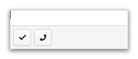
GtkActionBar is expected to be displayed below the content and expand
horizontally to fill the area.
It allows placing children at the start or the end. In addition, it contains an internal centered box which is centered with respect to the full width of the box, even if the children at either side take up different amounts of space.
GtkActionBar as GtkBuildable#
The GtkActionBar implementation of the GtkBuildable interface supports
adding children at the start or end sides by specifying “start” or “end” as
the “type” attribute of a <child> element, or setting the center widget
by specifying “center” value.
CSS nodes#
actionbar
╰── revealer
    ╰── box
        ├── box.start
        │   ╰── [start children]
        ├── [center widget]
        ╰── box.end
            ╰── [end children]
A GtkActionBar's CSS node is called actionbar. It contains a revealer
subnode, which contains a box subnode, which contains two box subnodes at
the start and end of the action bar, with start and end style classes
respectively, as well as a center node that represents the center child.
Each of the boxes contains children packed for that side.
Constructors#
Methods#
- class ActionBar
-
- pack_end(child: Widget) None#
Adds a child to the action bar, packed with reference to the end of the action bar.
- Parameters:
child – the widget to be added
- pack_start(child: Widget) None#
Adds a child to the action, packed with reference to the start of the action bar.
- Parameters:
child – the widget to be added
- remove(child: Widget) None#
Removes a child from the action bar.
- Parameters:
child – the widget to be removed