ProgressBar#
Superclasses: Widget, InitiallyUnowned, Object
Implemented Interfaces: Accessible, AccessibleRange, Buildable, ConstraintTarget, Orientable
Displays the progress of a long-running operation.
GtkProgressBar provides a visual clue that processing is underway.
It can be used in two different modes: percentage mode and activity mode.
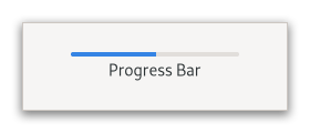
When an application can determine how much work needs to take place
(e.g. read a fixed number of bytes from a file) and can monitor its
progress, it can use the GtkProgressBar in percentage mode and the
user sees a growing bar indicating the percentage of the work that
has been completed. In this mode, the application is required to call
set_fraction periodically to update the progress bar.
When an application has no accurate way of knowing the amount of work
to do, it can use the GtkProgressBar in activity mode, which shows
activity by a block moving back and forth within the progress area. In
this mode, the application is required to call pulse
periodically to update the progress bar.
There is quite a bit of flexibility provided to control the appearance
of the GtkProgressBar. Functions are provided to control the orientation
of the bar, optional text can be displayed along with the bar, and the
step size used in activity mode can be set.
CSS nodes#
progressbar[.osd]
├── [text]
╰── trough[.empty][.full]
    ╰── progress[.pulse]
GtkProgressBar has a main CSS node with name progressbar and subnodes with
names text and trough, of which the latter has a subnode named progress. The
text subnode is only present if text is shown. The progress subnode has the
style class .pulse when in activity mode. It gets the style classes .left,
.right, .top or .bottom added when the progress ‘touches’ the corresponding
end of the GtkProgressBar. The .osd class on the progressbar node is for use
in overlays like the one Epiphany has for page loading progress.
Accessibility#
GtkProgressBar uses the progress_bar role
and sets the value_min, value_max and value_now properties to reflect
the progress.
Constructors#
Methods#
- class ProgressBar
- get_ellipsize() EllipsizeMode#
Returns the ellipsizing position of the progress bar.
See
set_ellipsize.
- get_pulse_step() float#
Retrieves the pulse step.
See
set_pulse_step.
- get_show_text() bool#
Returns whether the
GtkProgressBarshows text.See
set_show_text.
- get_text() str | None#
Retrieves the text that is displayed with the progress bar.
The return value is a reference to the text, not a copy of it, so will become invalid if you change the text in the progress bar.
- pulse() None#
Indicates that some progress has been made, but you don’t know how much.
Causes the progress bar to enter “activity mode,” where a block bounces back and forth. Each call to
pulsecauses the block to move by a little bit (the amount of movement per pulse is determined byset_pulse_step).
- set_ellipsize(mode: EllipsizeMode) None#
Sets the mode used to ellipsize the text.
The text is ellipsized if there is not enough space to render the entire string.
- Parameters:
mode – a
PangoEllipsizeMode
- set_fraction(fraction: float) None#
Causes the progress bar to “fill in” the given fraction of the bar.
The fraction should be between 0.0 and 1.0, inclusive.
- Parameters:
fraction – fraction of the task that’s been completed
- set_inverted(inverted: bool) None#
Sets whether the progress bar is inverted.
Progress bars normally grow from top to bottom or left to right. Inverted progress bars grow in the opposite direction.
- Parameters:
inverted –
Trueto invert the progress bar
- set_pulse_step(fraction: float) None#
Sets the fraction of total progress bar length to move the bouncing block.
The bouncing block is moved when
pulseis called.- Parameters:
fraction – fraction between 0.0 and 1.0
- set_show_text(show_text: bool) None#
Sets whether the progress bar will show text next to the bar.
The shown text is either the value of the
textproperty or, if that isNone, thefractionvalue, as a percentage.To make a progress bar that is styled and sized suitably for containing text (even if the actual text is blank), set
show_texttoTrueandtextto the empty string (notNone).- Parameters:
show_text – whether to show text
- set_text(text: str | None = None) None#
Causes the given
textto appear next to the progress bar.If
textisNoneandshow_textisTrue, the current value offractionwill be displayed as a percentage.If
textis non-Noneandshow_textisTrue, the text will be displayed. In this case, it will not display the progress percentage. Iftextis the empty string, the progress bar will still be styled and sized suitably for containing text, as long asshow_textisTrue.- Parameters:
text – a UTF-8 string
Properties#
- class ProgressBar
- props.ellipsize: EllipsizeMode#
The preferred place to ellipsize the string.
The text will be ellipsized if the progress bar does not have enough room to display the entire string, specified as a
PangoEllipsizeMode.Note that setting this property to a value other than %PANGO_ELLIPSIZE_NONE has the side-effect that the progress bar requests only enough space to display the ellipsis (”…”). Another means to set a progress bar’s width is
set_size_request.
- props.show_text: bool#
Sets whether the progress bar will show a text in addition to the bar itself.
The shown text is either the value of the
textproperty or, if that isNone, thefractionvalue, as a percentage.To make a progress bar that is styled and sized suitably for showing text (even if the actual text is blank), set
show_texttoTrueandtextto the empty string (notNone).