TabOverview#
Added in version 1.3.
Superclasses: Widget, InitiallyUnowned, Object
Implemented Interfaces: Accessible, Buildable, ConstraintTarget
A tab overview for TabView.
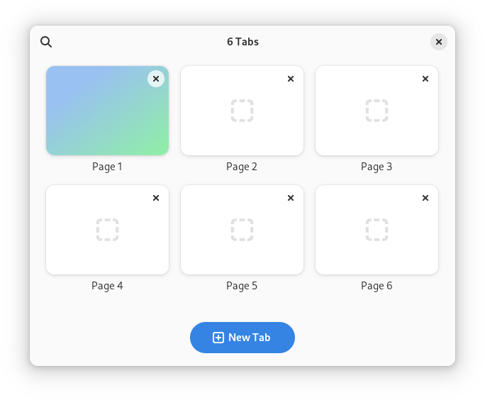
AdwTabOverview is a widget that can display tabs from an AdwTabView in a
grid.
AdwTabOverview shows a thumbnail for each tab. By default thumbnails are
static for all pages except the selected one. They can be made always live
by setting live_thumbnail to TRUE, or refreshed with
invalidate_thumbnail or
invalidate_thumbnails otherwise.
If the pages are too tall or too wide, the thumbnails will be cropped; use
thumbnail_xalign and thumbnail_yalign to
control which part of the page should be visible in this case.
Pinned tabs are shown as smaller cards without thumbnails above the other
tabs. Unlike in TabBar, they still have titles, as well as an unpin
button.
AdwTabOverview provides search in open tabs. It searches in tab titles and
tooltips, as well as keyword.
If enable_new_tab is set to TRUE, a new tab button
will be shown. Connect to the create_tab signal to use
it.
secondary_menu can be used to provide a secondary menu
for the overview. Use it to add extra actions, e.g. to open a new window or
undo closed tab.
AdwTabOverview is intended to be used as the direct child of the window,
with the rest of the window contents set as the child.
The child is expected to contain an TabView.
AdwTabOverview shows window buttons by default. They can be disabled by
setting show_start_title_buttons and/or
show_start_title_buttons and/or
show_end_title_buttons to FALSE.
If search and window buttons are disabled, and secondary menu is not set, the header bar will be hidden.
Actions#
AdwTabOverview defines the overview.open and overview.close actions for
opening and closing itself. They can be convenient when used together with
TabButton.
CSS nodes#
AdwTabOverview has a single CSS node with name taboverview.
Constructors#
Methods#
- class TabOverview
-
- get_enable_new_tab() bool#
Gets whether to new tab button is enabled for
self.Added in version 1.3.
- get_extra_drag_preferred_action() DragAction#
Gets the current action during a drop on the extra_drop_target.
Added in version 1.4.
- get_extra_drag_preload() bool#
Gets whether drop data should be preloaded on hover.
Added in version 1.3.
- get_search_active() bool#
Gets whether search is currently active for
self.See
enable_search.Added in version 1.3.
Gets the secondary menu model for
self.Added in version 1.3.
- get_show_end_title_buttons() bool#
Gets whether end title buttons are shown in
self's header bar.Added in version 1.3.
- get_show_start_title_buttons() bool#
Gets whether start title buttons are shown in
self's header bar.Added in version 1.3.
- set_child(child: Widget | None = None) None#
Sets the child widget of
self.Added in version 1.3.
- Parameters:
child – the child widget
- set_enable_new_tab(enable_new_tab: bool) None#
Sets whether to enable new tab button for
self.Connect to the
create_tabsignal to use it.Added in version 1.3.
- Parameters:
enable_new_tab – whether to enable new tab button
- set_enable_search(enable_search: bool) None#
Sets whether to enable search in tabs for
self.Search matches tab titles and tooltips, as well as keywords, set via
keyword. Use keywords to search in e.g. page URLs in a web browser.During search, tab reordering and drag-n-drop are disabled.
Use
search_activeto check out if search is currently active.Added in version 1.3.
- Parameters:
enable_search – whether to enable search
- set_extra_drag_preload(preload: bool) None#
Sets whether drop data should be preloaded on hover.
See
preload.Added in version 1.3.
- Parameters:
preload – whether to preload drop data
- set_inverted(inverted: bool) None#
Sets whether thumbnails use inverted layout.
If set to
TRUE, thumbnails will have the close or unpin button at the beginning and the indicator at the end rather than the other way around.Added in version 1.3.
- Parameters:
inverted – whether thumbnails use inverted layout
- set_open(open: bool) None#
Sets whether the to open
self.Added in version 1.3.
- Parameters:
open – whether the overview is open
Sets the secondary menu model for
self.Use it to add extra actions, e.g. to open a new window or undo closed tab.
Added in version 1.3.
- Parameters:
secondary_menu – a menu model
- set_show_end_title_buttons(show_end_title_buttons: bool) None#
Sets whether to show end title buttons in
self's header bar.See
show_start_title_buttonsfor the other side.Added in version 1.3.
- Parameters:
show_end_title_buttons – whether to show end title buttons
- set_show_start_title_buttons(show_start_title_buttons: bool) None#
Sets whether to show start title buttons in
self's header bar.See
show_end_title_buttonsfor the other side.Added in version 1.3.
- Parameters:
show_start_title_buttons – whether to show start title buttons
- set_view(view: TabView | None = None) None#
Sets the tab view to control.
The view must be inside
self, seechild.Added in version 1.3.
- Parameters:
view – a tab view
- setup_extra_drop_target(actions: DragAction, types: list[GType] | None = None) None#
Sets the supported types for this drop target.
Sets up an extra drop target on tabs.
This allows to drag arbitrary content onto tabs, for example URLs in a web browser.
If a tab is hovered for a certain period of time while dragging the content, it will be automatically selected.
The
extra_drag_dropsignal can be used to handle the drop.Added in version 1.3.
- Parameters:
actions – the supported actions
types – all supported
GTypes that can be dropped
Properties#
- class TabOverview
-
- props.extra_drag_preferred_action: DragAction#
The type of the None singleton.
Added in version 1.4.
The type of the None singleton.
Added in version 1.3.
Signals#
- class TabOverview.signals
-
- extra_drag_drop(page: TabPage, value: Value) bool#
The type of the None singleton.
Added in version 1.3.
- Parameters:
page – the page matching the tab the content was dropped onto
value – the
GValuebeing dropped
- extra_drag_value(page: TabPage, value: Value) DragAction#
The type of the None singleton.
Added in version 1.3.
- Parameters:
page – the page matching the tab the content was dropped onto
value – the
GValuebeing dropped