TabBar#
Superclasses: Widget, InitiallyUnowned, Object
Implemented Interfaces: Accessible, Buildable, ConstraintTarget
A tab bar for TabView.
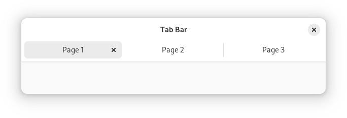
The AdwTabBar widget is a tab bar that can be used with conjunction with
AdwTabView. It is typically used as a top bar within ToolbarView.
AdwTabBar can autohide and can optionally contain action widgets on both
sides of the tabs.
When there’s not enough space to show all the tabs, AdwTabBar will scroll
them. Pinned tabs always stay visible and aren’t a part of the scrollable
area.
CSS nodes#
AdwTabBar has a single CSS node with name tabbar.
Style classes#
By default AdwTabBar look like a part of an AdwHeaderBar and is intended
to be used directly attached to one or used as a ToolbarView toolbar.
The `.inline <style-classes.html#inline>`__ style class removes its background,
so that it can be used in different contexts instead.

Constructors#
Methods#
- class TabBar
-
- get_extra_drag_preferred_action() DragAction#
Gets the current action during a drop on the extra_drop_target.
Added in version 1.4.
- get_extra_drag_preload() bool#
Gets whether drop data should be preloaded on hover.
Added in version 1.3.
- get_is_overflowing() bool#
Gets whether
selfis overflowing.If
TRUE, all tabs cannot be displayed at once and require scrolling.
- set_autohide(autohide: bool) None#
Sets whether the tabs automatically hide.
If set to
TRUE, the tab bar disappears whenviewhas 0 or 1 tab, no pinned tabs, and no tab is being transferred.See
tabs_revealed.- Parameters:
autohide – whether the tabs automatically hide
- set_end_action_widget(widget: Widget | None = None) None#
Sets the widget to show after the tabs.
- Parameters:
widget – the widget to show after the tabs
- set_expand_tabs(expand_tabs: bool) None#
Sets whether tabs expand to full width.
If set to
TRUE, the tabs will always vary width filling the whole width when possible, otherwise tabs will always have the minimum possible size.- Parameters:
expand_tabs – whether to expand tabs
- set_extra_drag_preload(preload: bool) None#
Sets whether drop data should be preloaded on hover.
See
preload.Added in version 1.3.
- Parameters:
preload – whether to preload drop data
- set_inverted(inverted: bool) None#
Sets whether tabs tabs use inverted layout.
If set to
TRUE, non-pinned tabs will have the close button at the beginning and the indicator at the end rather than the opposite.- Parameters:
inverted – whether tabs use inverted layout
- set_start_action_widget(widget: Widget | None = None) None#
Sets the widget to show before the tabs.
- Parameters:
widget – the widget to show before the tabs
- set_view(view: TabView | None = None) None#
Sets the tab view
selfcontrols.- Parameters:
view – a tab view
- setup_extra_drop_target(actions: DragAction, types: list[GType] | None = None) None#
Sets the supported types for this drop target.
Sets up an extra drop target on tabs.
This allows to drag arbitrary content onto tabs, for example URLs in a web browser.
If a tab is hovered for a certain period of time while dragging the content, it will be automatically selected.
The
extra_drag_dropsignal can be used to handle the drop.- Parameters:
actions – the supported actions
types – all supported
GTypes that can be dropped
Properties#
- class TabBar
-
- props.extra_drag_preferred_action: DragAction#
The type of the None singleton.
Added in version 1.4.
Signals#
- class TabBar.signals
- extra_drag_drop(page: TabPage, value: Value) bool#
The type of the None singleton.
- Parameters:
page – the page matching the tab the content was dropped onto
value – the
GValuebeing dropped
- extra_drag_value(page: TabPage, value: Value) DragAction#
The type of the None singleton.
Added in version 1.3.
- Parameters:
page – the page matching the tab the content was dropped onto
value – the
GValuebeing dropped