EntryRow#
Added in version 1.2.
Superclasses: PreferencesRow, ListBoxRow, Widget, InitiallyUnowned, Object
Subclasses: PasswordEntryRow
Implemented Interfaces: Accessible, Actionable, Buildable, ConstraintTarget, Editable
A ListBoxRow with an embedded text entry.
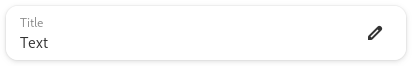
AdwEntryRow has a title that doubles as placeholder text. It shows an icon
indicating that it’s editable and can receive additional widgets before or
after the editable part.
If show_apply_button is set to TRUE, AdwEntryRow can
show an apply button when editing its contents. This can be useful if
changing its contents can result in an expensive operation, such as network
activity.
AdwEntryRow provides only minimal API and should be used with the
Editable API.
See also PasswordEntryRow.
AdwEntryRow as GtkBuildable#
The AdwEntryRow implementation of the Buildable interface
supports adding a child at its end by specifying “suffix” or omitting the
“type” attribute of a <child> element.
It also supports adding a child as a prefix widget by specifying “prefix” as the “type” attribute of a <child> element.
CSS nodes#
AdwEntryRow has a single CSS node with name row and the .entry style
class.
Constructors#
Methods#
- class EntryRow
- add_prefix(widget: Widget) None#
Adds a prefix widget to
self.Added in version 1.2.
- Parameters:
widget – a widget
- add_suffix(widget: Widget) None#
Adds a suffix widget to
self.Added in version 1.2.
- Parameters:
widget – a widget
- get_activates_default() bool#
Gets whether activating the embedded entry can activate the default widget.
Added in version 1.2.
- get_attributes() AttrList | None#
Gets Pango attributes applied to the text of the embedded entry.
Added in version 1.2.
- get_enable_emoji_completion() bool#
Gets whether to suggest emoji replacements on
self.Added in version 1.2.
- get_input_hints() InputHints#
Gets the additional input hints of
self.Added in version 1.2.
- get_input_purpose() InputPurpose#
Gets the input purpose of
self.Added in version 1.2.
- grab_focus_without_selecting() bool#
Causes
selfto have keyboard focus without selecting the text.See
grab_focus_without_selectingfor more information.Added in version 1.3.
- remove(widget: Widget) None#
Removes a child from
self.Added in version 1.2.
- Parameters:
widget – the child to be removed
- set_activates_default(activates: bool) None#
Sets whether activating the embedded entry can activate the default widget.
Added in version 1.2.
- Parameters:
activates – whether to activate the default widget
- set_attributes(attributes: AttrList | None = None) None#
Sets Pango attributes to apply to the text of the embedded entry.
The
Attribute'sstart_indexandend_indexmust refer to theEntryBuffertext, i.e. without the preedit string.Added in version 1.2.
- Parameters:
attributes – a list of attributes
- set_enable_emoji_completion(enable_emoji_completion: bool) None#
Sets whether to suggest emoji replacements on
self.Emoji replacement is done with :-delimited names, like
:heart:.Added in version 1.2.
- Parameters:
enable_emoji_completion – Whether emoji completion should be enabled or not
- set_input_hints(hints: InputHints) None#
Set additional input hints for
self.Input hints allow input methods to fine-tune their behavior.
See also:
input_purposeAdded in version 1.2.
- Parameters:
hints – the hints
- set_input_purpose(purpose: InputPurpose) None#
Sets the input purpose of
self.The input purpose can be used by input methods to adjust their behavior.
Added in version 1.2.
- Parameters:
purpose – the purpose
- set_max_length(max_length: int) None#
Sets the maximum length of the entry.
Added in version 1.6.
- Parameters:
max_length – maximum length of the entry
- set_show_apply_button(show_apply_button: bool) None#
Sets whether
selfcan show the apply button.When set to
TRUE, typing text in the entry will reveal an apply button. Clicking it or pressing the Enter key will hide the button and emit theapplysignal.This is useful if changing the entry contents can trigger an expensive operation, e.g. network activity, to avoid triggering it after typing every character.
Added in version 1.2.
- Parameters:
show_apply_button – whether to show the apply button
Properties#
- class EntryRow
- props.activates_default: bool#
Whether activating the embedded entry can activate the default widget.
Added in version 1.2.
- props.attributes: AttrList#
A list of Pango attributes to apply to the text of the embedded entry.
The
Attribute'sstart_indexandend_indexmust refer to theEntryBuffertext, i.e. without the preedit string.Added in version 1.2.
- props.enable_emoji_completion: bool#
Whether to suggest emoji replacements on the entry row.
Emoji replacement is done with :-delimited names, like
:heart:.Added in version 1.2.
- props.input_hints: InputHints#
Additional input hints for the entry row.
Input hints allow input methods to fine-tune their behavior.
See also:
input_purposeAdded in version 1.2.
- props.input_purpose: InputPurpose#
The input purpose of the entry row.
The input purpose can be used by input methods to adjust their behavior.
Added in version 1.2.
- props.show_apply_button: bool#
Whether to show the apply button.
When set to
TRUE, typing text in the entry will reveal an apply button. Clicking it or pressing the Enter key will hide the button and emit theapplysignal.This is useful if changing the entry contents can trigger an expensive operation, e.g. network activity, to avoid triggering it after typing every character.
Added in version 1.2.
Signals#
- class EntryRow.signals
- apply() None#
Emitted when the apply button is pressed.
See
show_apply_button.Added in version 1.2.
Fields#
- class EntryRow
- parent_instance#