Ctrl+K

GNOME Python API

  • GLib
  • Gio
  • GObject
  • Gtk
  • Gdk
  • Adw
    • DBus
    • DBusGLib
    • Flatpak
    • GModule
    • Gcr
    • GdkPixbuf
    • GdkPixdata
    • GdkWayland
    • GdkX11
    • Gly
    • Graphene
    • Gsk
    • Gst
    • GstBase
    • GstCheck
    • GstController
    • GstNet
    • GtkSource
    • HarfBuzz
    • ICalGLib
    • JavaScriptCore
    • Pango
    • PangoCairo
    • PangoFT2
    • PangoFc
    • PangoOT
    • PangoXft
    • Shumate
    • Soup
    • Vte
    • WebKit
    • WebKitWebProcessExtension
    • Xdp
    • XdpGtk4
    • pycairo
  • GLib
  • Gio
  • GObject
  • Gtk
  • Gdk
  • Adw
  • DBus
  • DBusGLib
  • Flatpak
  • GModule
  • Gcr
  • GdkPixbuf
  • GdkPixdata
  • GdkWayland
  • GdkX11
  • Gly
  • Graphene
  • Gsk
  • Gst
  • GstBase
  • GstCheck
  • GstController
  • GstNet
  • GtkSource
  • HarfBuzz
  • ICalGLib
  • JavaScriptCore
  • Pango
  • PangoCairo
  • PangoFT2
  • PangoFc
  • PangoOT
  • PangoXft
  • Shumate
  • Soup
  • Vte
  • WebKit
  • WebKitWebProcessExtension
  • Xdp
  • XdpGtk4
  • pycairo

Section Navigation

API

  • Classes
    • AboutDialog
    • AboutWindow
    • ActionRow
    • AlertDialog
    • Animation
    • AnimationTarget
    • Application
    • ApplicationWindow
    • Avatar
    • Banner
    • Bin
    • BottomSheet
    • Breakpoint
    • BreakpointBin
    • ButtonContent
    • ButtonRow
    • CallbackAnimationTarget
    • Carousel
    • CarouselIndicatorDots
    • CarouselIndicatorLines
    • Clamp
    • ClampLayout
    • ClampScrollable
    • ComboRow
    • Dialog
    • EntryRow
    • EnumListItem
    • EnumListModel
    • ExpanderRow
    • Flap
    • HeaderBar
    • InlineViewSwitcher
    • Layout
    • LayoutSlot
    • Leaflet
    • LeafletPage
    • MessageDialog
    • MultiLayoutView
    • NavigationPage
    • NavigationSplitView
    • NavigationView
    • NoneAnimationTarget
    • OverlaySplitView
    • PasswordEntryRow
    • PreferencesDialog
    • PreferencesGroup
    • PreferencesPage
    • PreferencesRow
    • PreferencesWindow
    • PropertyAnimationTarget
    • ShortcutLabel
    • ShortcutsDialog
    • ShortcutsItem
    • ShortcutsSection
    • Sidebar
    • SidebarItem
    • SidebarSection
    • SpinRow
    • Spinner
    • SpinnerPaintable
    • SplitButton
    • SpringAnimation
    • Squeezer
    • SqueezerPage
    • StatusPage
    • StyleManager
    • SwipeTracker
    • SwitchRow
    • TabBar
    • TabButton
    • TabOverview
    • TabPage
    • TabView
    • TimedAnimation
    • Toast
    • ToastOverlay
    • Toggle
    • ToggleGroup
    • ToolbarView
    • ViewStack
    • ViewStackPage
    • ViewStackPages
    • ViewSwitcher
    • ViewSwitcherBar
    • ViewSwitcherSidebar
    • ViewSwitcherTitle
    • Window
    • WindowTitle
    • WrapBox
    • WrapLayout
  • Interfaces
    • Swipeable
  • Structures
    • BreakpointCondition
    • SpringParams
  • Enums
    • AccentColor
    • AnimationState
    • BannerButtonStyle
    • BreakpointConditionLengthType
    • BreakpointConditionRatioType
    • CenteringPolicy
    • ColorScheme
    • DialogPresentationMode
    • Easing
    • FlapFoldPolicy
    • FlapTransitionType
    • FoldThresholdPolicy
    • InlineViewSwitcherDisplayMode
    • JustifyMode
    • LeafletTransitionType
    • LengthUnit
    • NavigationDirection
    • PackDirection
    • ResponseAppearance
    • SidebarMode
    • SqueezerTransitionType
    • TabViewShortcuts
    • ToastPriority
    • ToolbarStyle
    • ViewSwitcherPolicy
    • WrapPolicy
  • Functions
  • Constants
  • Adw
  • Classes
  • Banner

Banner#

Added in version 1.3.

class Banner(**properties: Any)#

Superclasses: Widget, InitiallyUnowned, Object

Implemented Interfaces: Accessible, Actionable, Buildable, ConstraintTarget

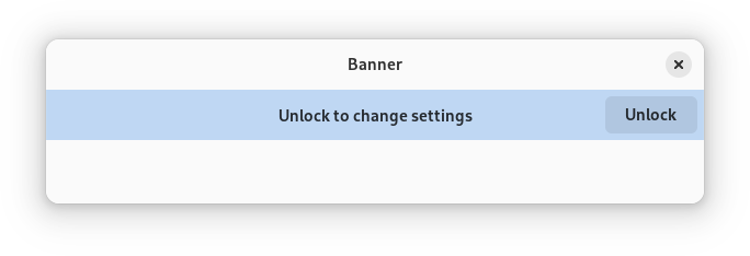
A bar with contextual information.
https://gnome.pages.gitlab.gnome.org/libadwaita/doc/1-latest/banner.png

Banners are hidden by default, use revealed to show them.

Banners have a title, set with title. Titles can be marked up with Pango markup, use use_markup to enable it.

The title will be shown centered or left-aligned depending on available space.

Banners can optionally have a button with text on it, set through button_label. The button can be used with a GAction, or with the button_clicked signal. The button can have different styles, a gray style and a suggested style.

https://gnome.pages.gitlab.gnome.org/libadwaita/doc/1-latest/banner-suggested.png

CSS nodes#

AdwBanner has a main CSS node with the name banner.

Constructors#

class Banner
classmethod new(title: str) → Widget#

Creates a new AdwBanner.

Added in version 1.3.

Parameters:

title – the banner title

Methods#

class Banner
get_button_label() → str | None#

Gets the button label for self.

Added in version 1.3.

get_button_style() → BannerButtonStyle#

Gets the style class in use for the banner button.

Added in version 1.7.

get_revealed() → bool#

Gets if a banner is revealed

Added in version 1.3.

get_title() → str#

Gets the title for self.

Added in version 1.3.

get_use_markup() → bool#

Gets whether to use Pango markup for the banner title.

Added in version 1.3.

set_button_label(label: str | None = None) → None#

Sets the button label for self.

If set to "" or NULL, the button won’t be shown.

The button can be used with a GAction, or with the button_clicked signal.

Added in version 1.3.

Parameters:

label – the label

set_button_style(style: BannerButtonStyle) → None#

Sets the style class to use for the banner button.

When set to default, the button is grey. When set to suggested, the button uses the `.suggested-action <style-classes.html#suggested-action>`__ appearance.

https://gnome.pages.gitlab.gnome.org/libadwaita/doc/1-latest/banner-suggested.png

Added in version 1.7.

Parameters:

style – a button style

set_revealed(revealed: bool) → None#

Sets whether a banner should be revealed

Added in version 1.3.

Parameters:

revealed – whether a banner should be revealed

set_title(title: str) → None#

Sets the title for this banner.

See also: use_markup.

Added in version 1.3.

Parameters:

title – the title

set_use_markup(use_markup: bool) → None#

Sets whether to use Pango markup for the banner title.

See also parse_markup.

Added in version 1.3.

Parameters:

use_markup – whether to use markup

Properties#

class Banner
props.button_label: str#

The label to show on the button.

If set to "" or NULL, the button won’t be shown.

The button can be used with a GAction, or with the button_clicked signal.

Added in version 1.3.

props.button_style: BannerButtonStyle#

The style class to use for the banner button.

When set to default, the button is grey. When set to suggested, the button uses the `.suggested-action <style-classes.html#suggested-action>`__ appearance.

https://gnome.pages.gitlab.gnome.org/libadwaita/doc/1-latest/banner-suggested.png

Added in version 1.7.

props.revealed: bool#

Whether the banner is currently revealed.

Added in version 1.3.

props.title: str#

The title for this banner.

See also: use_markup.

Added in version 1.3.

props.use_markup: bool#

Whether to use Pango markup for the banner title.

See also parse_markup.

Added in version 1.3.

Signals#

class Banner.signals
button_clicked() → None#

This signal is emitted after the action button has been clicked.

It can be used as an alternative to setting an action.

Added in version 1.3.

On this page
  • CSS nodes
  • Constructors
    • Banner.new()
  • Methods
    • Banner.get_button_label()
    • Banner.get_button_style()
    • Banner.get_revealed()
    • Banner.get_title()
    • Banner.get_use_markup()
    • Banner.set_button_label()
    • Banner.set_button_style()
    • Banner.set_revealed()
    • Banner.set_title()
    • Banner.set_use_markup()
  • Properties
    • Banner.props.button_label
    • Banner.props.button_style
    • Banner.props.revealed
    • Banner.props.title
    • Banner.props.use_markup
  • Signals
    • Banner.signals.button_clicked()
Show Source

Created using Sphinx 8.2.3.

General Index

Built with the PyData Sphinx Theme 0.20.0.